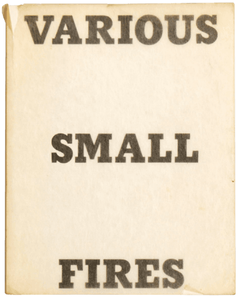
Hollywood
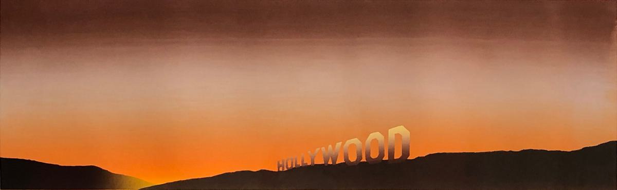
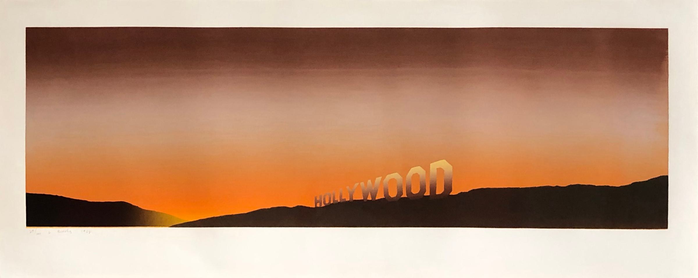
Hollywood was the first screenprint in colours which Ruscha printed and published by himself, and he did so through a process of trial-and-error. Two years previously, in 1966, he had produced Standard Station with the printer Art Krebs and had, no-doubt, felt emboldened by the experience.
“…(he recalls that he rigged a clothes-line system on which to hang the drying prints, only to return to the studio the following day to find they had fallen on the floor). Revisiting the screenprint medium, Ruscha worked as he had in the Standard Station prints, blending inks directly on the screen to create a gradation of colour. Because each print had a slightly different mixture of inks, the proofs that resulted often contained oddities and mistakes that the artist found intriguing and would document, tongue in check, along with the usual trial proofs and artist’s proofs. A “UFO” proof was created when a foreign object had been caught in the squeegee, causing a skip in the field of colour that was the sky. A “Lake Amarillo” proof was one on which the yellow ink pooled in the area of the image just beneath the dark hills, giving the appearance of a body of water reflecting the last light of day. Hollywood was an overtly panoramic print, emphasizing Ruscha’s view that horizontality and landscape – in this case the Hollywood hills as well as the three-syllable (read: long) word “Hollywood” – can be seen as synonymous notions. As he did in the painting of the same name, the artist explores the famous horizon by depicting the Hollywood sign in full view, perched on the crest of the hillside rather than nestled mid-slope, as it actually appears. The pop-up frontality of the image, rendered as a flat façade, presaged Ruscha’s attraction to the silhouette, which was to figure strongly in his work of the 1980s. Just as the word “Standard” labels the most pedestrian of architectural structures in the 1966 print and comments on the banality of the subject matter, the heraldic “Hollywood” emblazoned on a glowing amber sky heightens the romanticized associations that accompany that particular part of Los Angeles and its main industry. (“Hollywood is a verb,” announced a 1979 Ruscha pastel.) The image was a favourite of the artist’s, one he would revisit in several more screenprints and lithographs the following year.”
Inspiration for the presentation of the Hollywood sign in this way may have come from a still from a movie filmed in Panavision and, in common with many of his first explorations in imagery relating to the film industry, was very much considered from a viewer-oriented perspective.
The vivid colouring of this example is a result of an unique mix of the four colours used in the split-fountain process for the background screen: yellow, orange, purple and mauve.
Hollywood
- Artist
- Ed Ruscha (b.1937)
- Title
- Hollywood
- Medium
- Screenprint on white paper
- Date
- 1968
- Size
- 17 ½ x 44 ½ in : 44.5 x 112.9 cm
- Framed Size
- 20 ¼ x 47 in : 51.2 x 119.5 cm
- Edition
- From the edition of 100, signed, dated and numbered by the artist
- Publisher
- Published by the artist
- Printer
- Printed by the artist
- Notes
- 8 colours printed in 4 runs from 4 screens: 1. Yellow, Orange, Purple, Mauve (split fountain); 2. Dark brown - screen; 3. Brown, Yellow (split fountain) - screen; 4. Yellow - screen
- Literature
- Engberg 7
- Reference
- A23-04
- Download PDF
- Status
- No Longer Available
Available Artists
- Albers Anni
- Ancart Harold
- Andre Carl
- Avery Milton
- Baldessari John
- Barnes Ernie
- Castellani Enrico
- Crawford Brett
- Dadamaino
- de Tollenaere Saskia
- Dyson Julian
- Elsner Slawomir
- Freud Lucian
- Gadsby Eric
- Gander Ryan
- Guston Philip
- Hayes David
- Held Al
- Hill Anthony
- Hockney David
- Hutchinson Norman Douglas
- Jenney Neil
- Katz Alex
- Kentridge William
- Knifer Julije
- Kusama Yayoi
- Le Parc Julio
- Leciejewski Edgar
- Léger Fernand
- Levine Chris
- Marchéllo
- Mavignier Almir da Silva
- Miller Harland
- Modé João
- Morellet François
- Nadelman Elie
- Nara Yoshitomo
- Nesbitt Lowell Blair
- O'Donoghue Hughie
- Perry Grayson
- Picasso Pablo
- Pickstone Sarah
- Prehistoric Objects
- Riley Bridget
- Ruscha Ed
- Sedgley Peter
- Serra Richard
- Shrigley David
- Smith Anj
- Smith Richard
- Soto Jesús Rafael
- Soulages Pierre
- Spencer Stanley
- Taller Popular de Serigrafía
- The Connor Brothers
- Vasarely Victor
- Wood Jonas