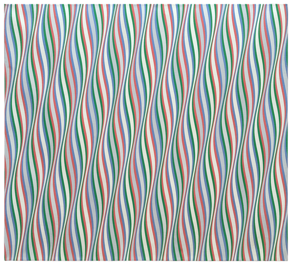
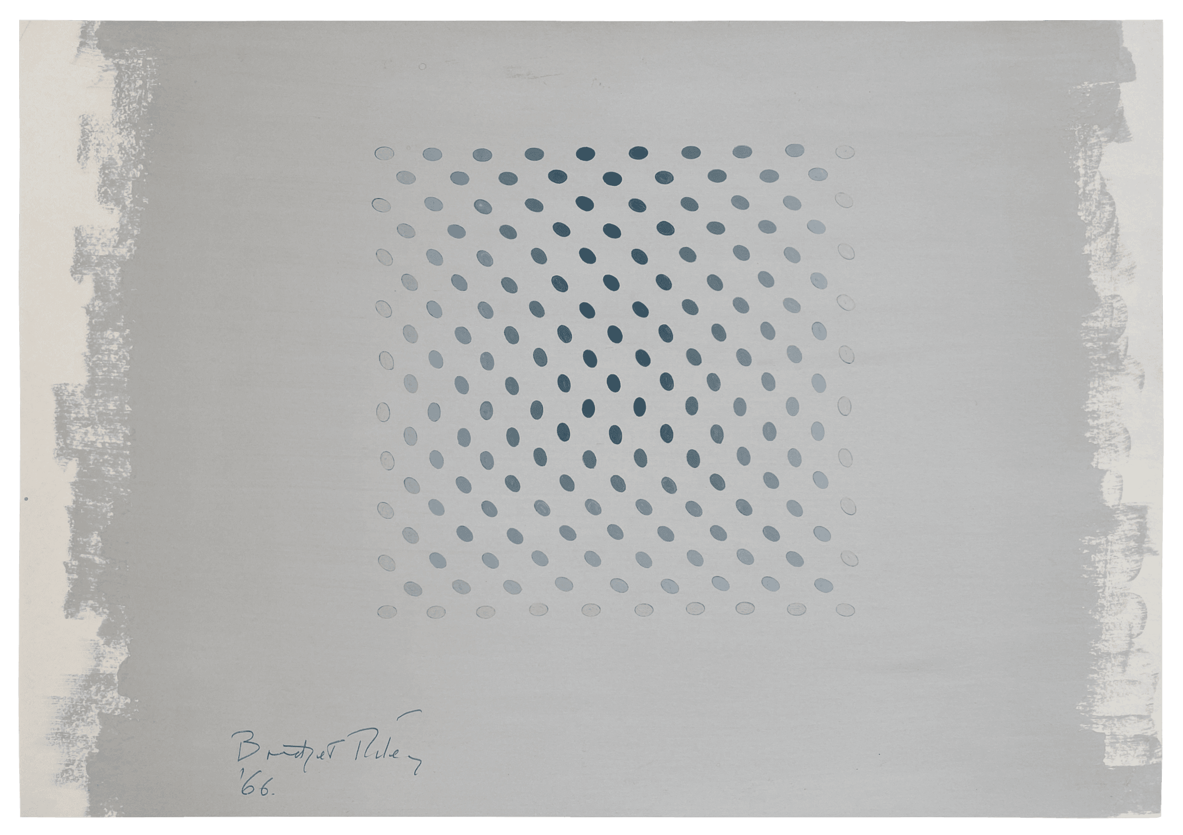
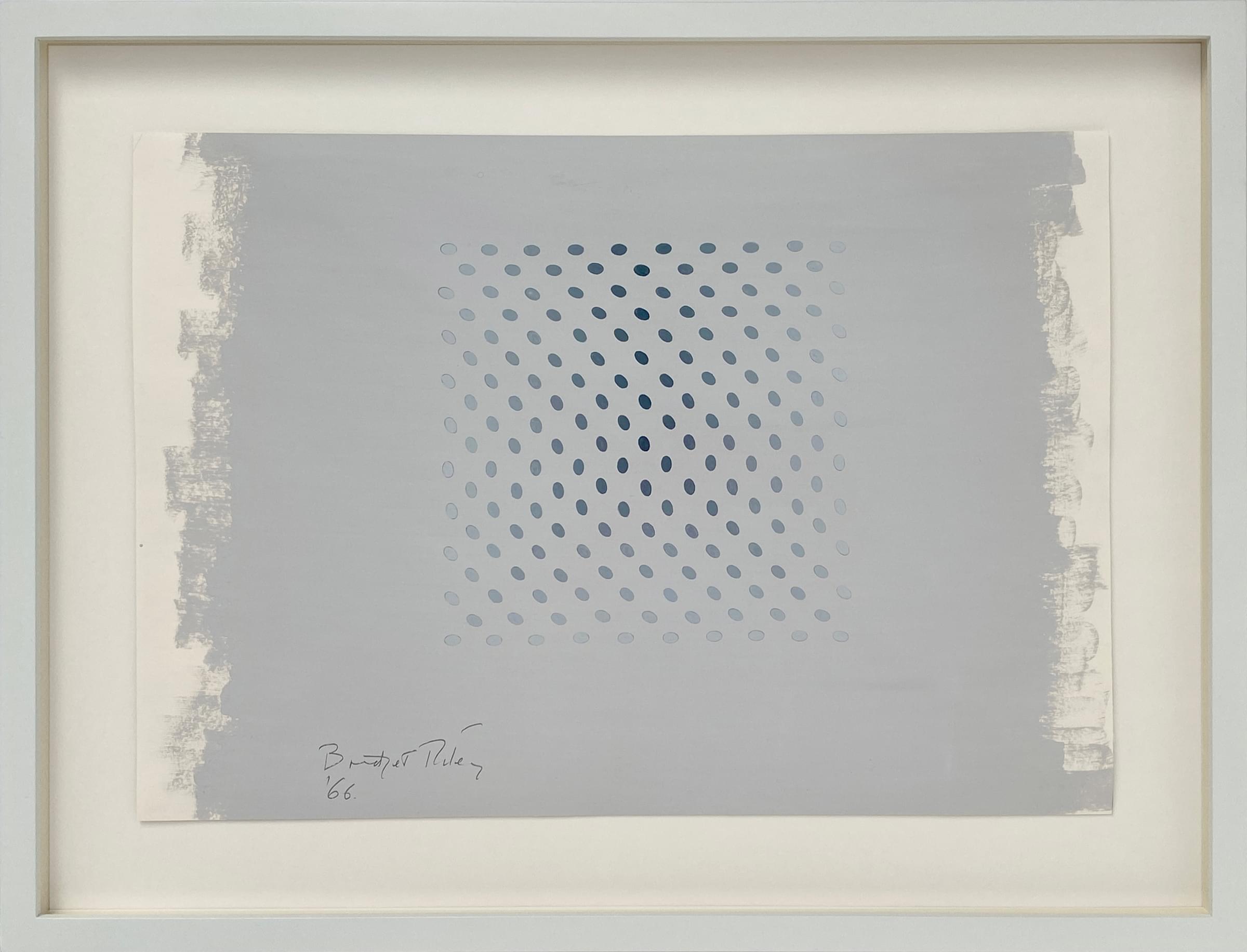
Untitled [Study towards Deny and Nineteen Greys]
In 1966/67, Bridget Riley ended her production of the black and white images which had mostly been her work for the previous 5 years, and started off towards colour. Several paintings from this short transitional period, mostly in museums and institutional collections around the world, form an exploratory series in grey tones and have titles indicating the word Deny. It has been suggested by the Tate, who have the painting Deny II in their permanent collection, that the title refers to an effect of tonal contrast:
"Riley manipulates shapes and colours in her paintings to generate complex visual sensations in the spectator. Here she explores the effects of tonal contrasts of warm and cold greys. Ovals painted in a range of cool greys are set against a dark, warm grey background. Where the darker ovals are seen against the dark ground, we become particularly aware of the difference in their colour. But where the tonal contrast is greatest, between the lighter ovals and the grey ground, the difference in colour is, as the title implies, denied."
Although in the present study, with its light grey ground, the tonal experiment is diametrically opposite, the argument for the meaning of denial remains equally valid. The late Tom Lubbock, art critic, wrote an article about Deny II in the Independent newspaper in 2005, much of which could also be about the present study. I have taken the liberty of replacing each instance of the word "dark" with "light" and vice versa in order to apply his observations to our picture:
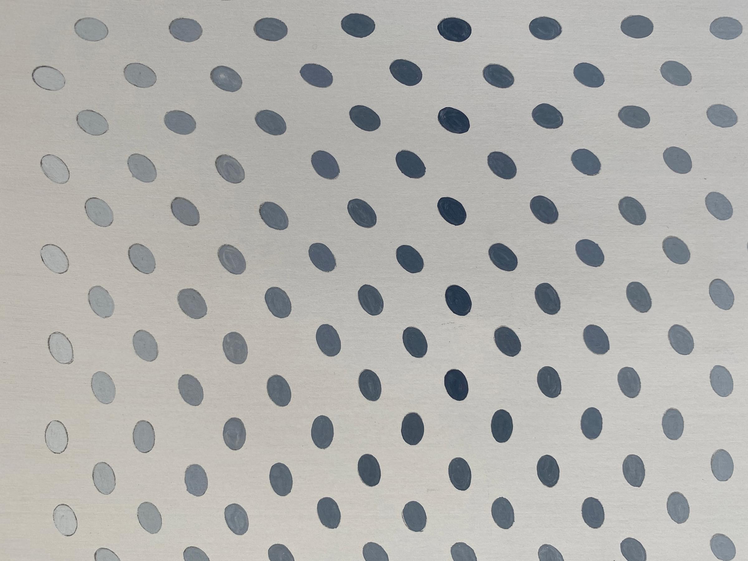
"Bridget Riley's Deny II is a permutation picture. It seems to operate by a set of numbered instructions. You have a square field of light grey, and it's a uniform light grey, though the eye never feels sure about this. On this field, a grid of small ovals is laid out...Each oval is the same shape, and each one stands out against the light grey field, even where the picture is at its lightest.
Among the [181] ovals, there are sequential variations in both their angle and their tone. Down each column, the ovals ...do a half- rotation, then a half-rotation back. They also go through gradations of greys, in symmetrical sequences, though these tonal scales would take longer to describe. But note that the upright oval(s) in the centre carries the darkest tone, and the lightest ovals are nearly as light as the background...
And, looking at this picture, and seeing how it's made up of distinct units that are put through definable transformations according to rules, you may think: this is a work whose performance you ought to be able to follow and analyse, step by step. That impression of perfect clarity is important. It's a crucial aspect of the work. It's true, too, when you focus on small areas. But take the picture whole, and your grasp starts slipping away. The permutations and their interactions move beyond reckoning.
The way the ovals rotate produces a sense of complex animation in the upper half of the picture. It's like an army band in a formation manoeuvre, or a flight of starlings, going many ways at once, revolving, swerving, peeling away. It defies any attempt to track it, step by step. Superimposed on this, there's the tonal agenda, equally elusive. It involves a kind of optical illusion...The effect, though achieved step by step, is so gradual that again you can't hold it in clear sight. The eye won't credit that it's only the ovals that are getting lighter, and not the background, too.
Now it gets complicated. The patterns of the rotating ovals, and of dark and light, aren't co-ordinated. They're two different configurations, which happen to be carried by the same grid of ovals. But for that reason they can't help fusing. You keep trying to see them as in gear together. You feel that the way the ovals swell into darkness is at one with the way they swerve. Then the feeling goes. Then returns. The breathing life of the picture lies in this tension.
Mystery and clarity are not at odds. The clarity creates the mystery. The elusive feelings of Deny II occur because, paradoxically, its procedures are so transparent. You can see it's all done with regular oval elements in permutations. You hold on to your conviction that it must all be graspable. And you go down with the ship, so to speak."
There would appear to be three other major Deny paintings in existence, Deny I, in the J.P. Morgan Chase collection. Deny III, presumably in a private collection, and Deny IV, in the Minneapolis Institute of Art, the square format of which is rotated by 45 degrees, hanging as a diamond shaped composition.
As would become Riley's custom, her explorations into a certain theme would be summarised in a suite of screenprints, and in 1968 Nineteen Greys A-D were published. The four screenprints which comprise the Nineteen Greys suite again have a grid of oval forms arranged in various ways. The designs for these prints were taken from studies unrealised as Deny canvas works, but being too interesting just to forget, much as the 1965 Fragments series of screenprints on plexiglas had come into being. The artist has said, however, that she believed a sheet of paper and not a large canvas was more appropriate to what she was trying to establish. Nineteen Greys A is of particular note, as it has 19 rows and columns in a 10-9-10-9.. formation, a formation shared by the present work, in which each oval is also made to rotate in exactly the same way. For this reason, we may note that the present work is not only a study towards the Deny paintings, but is also partly realised within Nineteen Greys, the title referring to the fact that the four prints are printed with nineteen different greys.
'Nineteen Greys is based upon the idea and sensation of denial. It involves certain visual juxtapositions and confrontations where the elements or their activities neutralise one another, cancel one another out. The central subject of the prints is the result of this neutralisation or cancellation.
‘What are these elements specifically? First of all, the grid; then, the angles; finally, the tonal movement. Each of these three organisational systems is made to move against the other two.
‘In these prints, the principle of regularity is expressed overtly in a grid system of unvarying intervals. The grid may be organised according to the right angles or diagonals. The angle movement is made to operate against the normal structure of these two kinds of grid, flowing from horizontal to vertical or from vertical to horizontal diagonally. In all of these prints, the angle movement departs from its original state to achieve its opposite and by degrees returns to its former orientation. The movement of reversal and return may be fast or slow. A variable movement is played against the equidistant beat of the grid. The movement consists of two systems, light-dark, warm-cold. Fundamentally in this suite there are two warm grey grounds against which the cold grey ovals are pitched and two cold grey grounds in reaction to ovals in warm grey. The tonal structure provided both a contrast in terms of light and dark and, where contrast is reduced or absent, a release of colour—emphasis upon sheer hue. Up to nineteen greys are used in the prints, tones filled with colour. In each print, the directional flow of the tones is at variance with movement of the angles and the structure of the grid.’
Published in The Tate Gallery Report 1970–1972, London 1972.
![Bridget Riley Untitled [Study towards Deny and Nineteen Greys] original painting](https://images.archeus.com/production/C16-68-Riley-Study-Towards-Deny-and-Nineteen-Greys-original-painting.png?w=1200&h=1200&q=82&auto=format&fit=clip&dm=1683056114&s=3fe76a9a0cd8244ab71f5e7d22fb7d96)
Untitled [Study towards Deny and Nineteen Greys]
- Artist
- Bridget Riley (b.1931)
- Title
- Untitled [Study towards Deny and Nineteen Greys]
- Medium
- Gouache on paper
- Date
- 1966
- Size
- 12 1/4 x 17 5/8 in : 31.1 x 44.7 cm
- Inscriptions
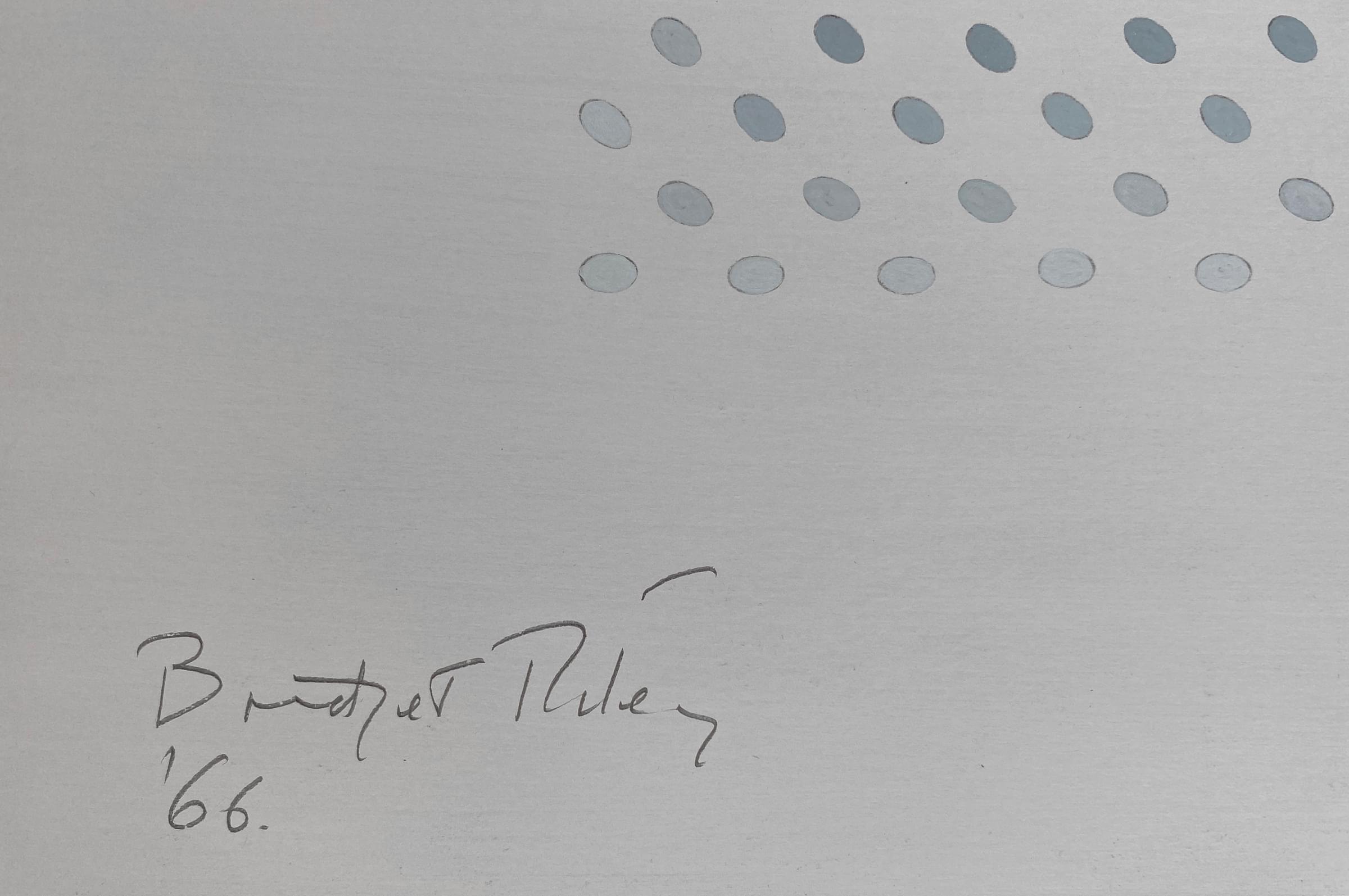
- Signed and dated lower left
- Provenance
- Private Collection, USA, since 1974
- Exhibited
- with Sprüth Magers, Art Basel 2019
- Literature
- This work can be closely compared to 'Untitled Study for 19 Greys' published in "Bridget Riley", Paul Moorhouse, Tate Publishing, London, 2003, no. 65, p.76 (col. illus.)
- Reference
- C16-78
- Status
- No Longer Available
Available Artists
- Albers Anni
- Ancart Harold
- Andre Carl
- Avery Milton
- Baldessari John
- Barnes Ernie
- Castellani Enrico
- Crawford Brett
- Dadamaino
- de Tollenaere Saskia
- Dyson Julian
- Elsner Slawomir
- Freud Lucian
- Gadsby Eric
- Gander Ryan
- Guston Philip
- Hayes David
- Held Al
- Hill Anthony
- Hockney David
- Hutchinson Norman Douglas
- Jenney Neil
- Katz Alex
- Kentridge William
- Knifer Julije
- Kusama Yayoi
- Le Parc Julio
- Leciejewski Edgar
- Léger Fernand
- Levine Chris
- Marchéllo
- Mavignier Almir da Silva
- Miller Harland
- Modé João
- Morellet François
- Nadelman Elie
- Nara Yoshitomo
- Nesbitt Lowell Blair
- O'Donoghue Hughie
- Perry Grayson
- Picasso Pablo
- Pickstone Sarah
- Prehistoric Objects
- Riley Bridget
- Ruscha Ed
- Sedgley Peter
- Serra Richard
- Shrigley David
- Smith Anj
- Smith Richard
- Soto Jesús Rafael
- Soulages Pierre
- Spencer Stanley
- Taller Popular de Serigrafía
- The Connor Brothers
- Vasarely Victor
- Wood Jonas